![Picup Media_Logo_on White_RGB.png]](https://support.picupmedia.com/hs-fs/hubfs/Picup%20Media_Logo_on%20White_RGB.png?height=40&name=Picup%20Media_Logo_on%20White_RGB.png)
Choosing the Right GemSparkle Backdrop
Quick Answer
To make your jewelry stand out, choose a backdrop that contrasts with your piece. Use the black backdrop for light-colored jewelry like diamonds and silver. Use the white backdrop for darker jewelry like yellow gold and colored gemstones.
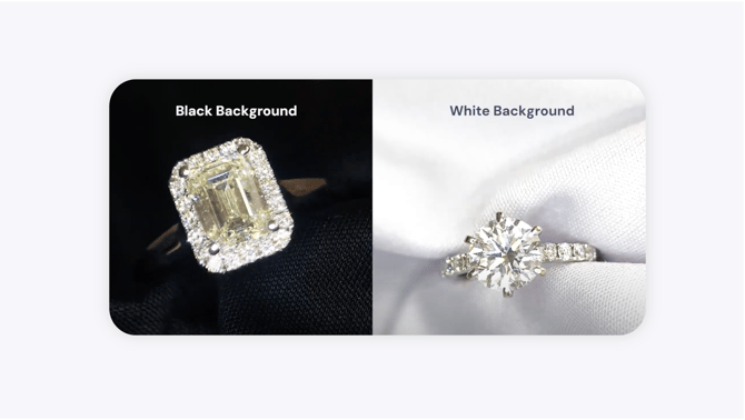
Backdrop Options
Your GemSparkle comes with two backdrops. Here is how to decide which one to use.
Option 1: Black Backdrop
The black backdrop is ideal for lighter-colored jewelry. The high contrast makes bright metals and stones appear more brilliant and detailed.
-
Best for: White gold, silver, platinum, diamonds, pearls, and light-colored gemstones.
-
Recommended App Setting: Pair with Eclipse Mode in the GemHub for a professional, polished result in a single click.
-gif.gif?width=1152&height=648&name=r%20(1)-gif.gif)
Option 2: White Backdrop
The white backdrop works best for darker-colored jewelry. The clean, bright background provides the contrast needed to bring out the rich tones of yellow metals and the deep colors of certain gemstones.
-
Best for: Yellow gold, rose gold, and dark gemstones like sapphires, rubies, and emeralds.
-
Recommended App Setting: Use Neutral Mode in the GemHub to capture clean, true-to-color results.
Option 3: Natural Backdrop (On-Hand)
Shooting jewelry on a hand provides natural context and gives customers a sense of scale and wearability. This is especially effective for rings and bracelets.
-
Best for: Rings, bracelets, and bangles where showing the item being worn is important.
Expected Result
By choosing the correct backdrop, your jewelry will have strong visual contrast, making it look vibrant, detailed, and professional in your photos and videos.
If This Does Not Work
The rule of contrast is a strong guideline, but not absolute. If your piece doesn't look right on the recommended backdrop, try the other one. Always trust your eye and experiment to find the best look for each unique piece of jewelry.
Common Mistakes
Low Contrast: Avoid photographing light jewelry on a light background or dark jewelry on a dark background. This can make your product look dull or washed out.
Not Experimenting: Don't be afraid to break the rules. Some pieces, especially those with mixed metals or multiple stones, may surprise you with which backdrop works best.